I used to feature show homes all the time on this here blog. You see, I used to work for a home builder on the team that designed the show homes from floor plan to picture hanging. I loved them. But then, I found they all started to look the same. Either that or I began seeing them through a jaded view, realizing the homes were decorated with way more expensive items than the home owners could ever afford. They are putting all of their money into the home itself. But I guess a home can be inspirational too. Either way, these feeling were all conflicted in my mind, and I stopped going to them so often. And stopped sharing the pictures all together.
That is, until I found this house. My mom saw it and said, OH Brooke, you have to go see it. I will take you back this week. If its worth a second showing to my mom, then I knew it was a house I needed to see. So, camera in hand (the employees were all a little awe struck that I was walking through with such a big camera just for fun) I toured this home to share with you.
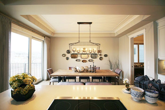
The dining table can comfortably seat 8 adults, but if needed you could squish kids together on those benches. The industrial light fixture is perfect set against the dainty vintage serving trays hanging on the wall. The grouping of candle sticks is the perfect touch.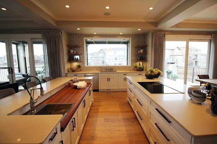
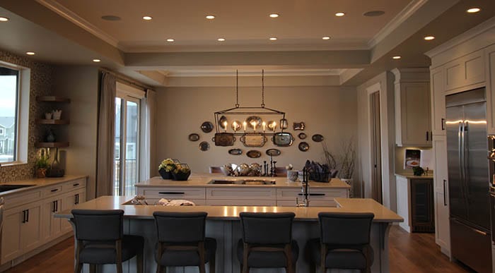
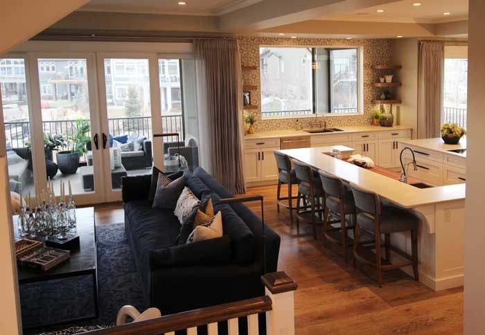
This kitchen is huge. I love the two long islands. One island is all drawers with the cook top placed on it, while the other has a lower section with butcher block counters. The lowered counters are a perfect design element for a shorter person (less of a stretch while chopping and cutting on that butcher block counter). The other counter tops are at the standard height. The main sink is on the far wall, facing the window. The prep sink is on the second island with the butcher block counters. I love the mosaic cement tile on the back wall. Its the perfect place for an accent wall with open shelves. This works because there is plenty of storage elsewhere in the kitchen.
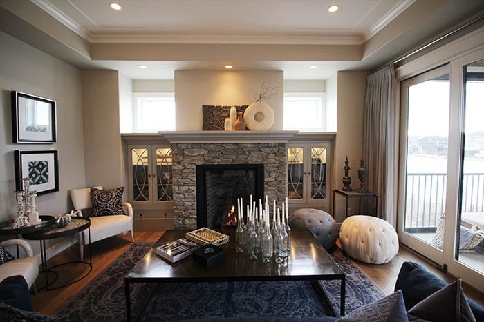
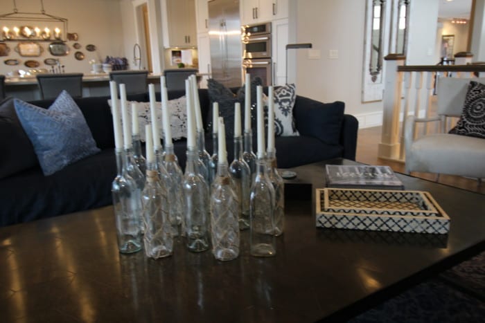
Off the kitchen is a small home office. I really like decorating with book pages, so this book page collage is my favorite.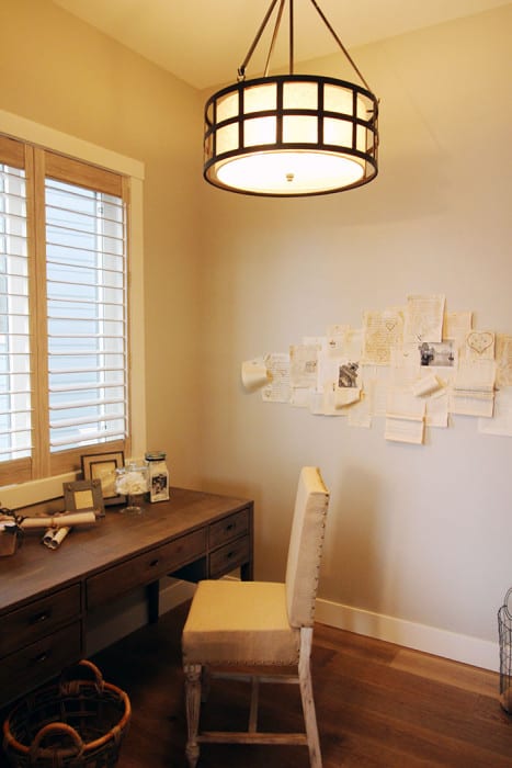
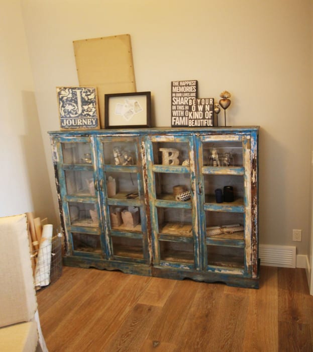
The front entry is large, spacious and bright. The board and batten paneling has me all swooning… Obviously I love board and batten (I have it in the front entry of my own house).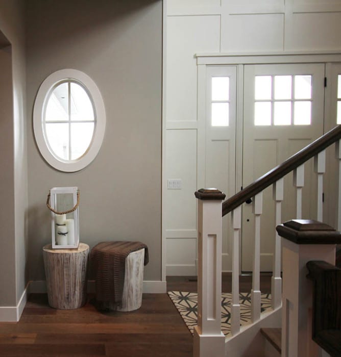
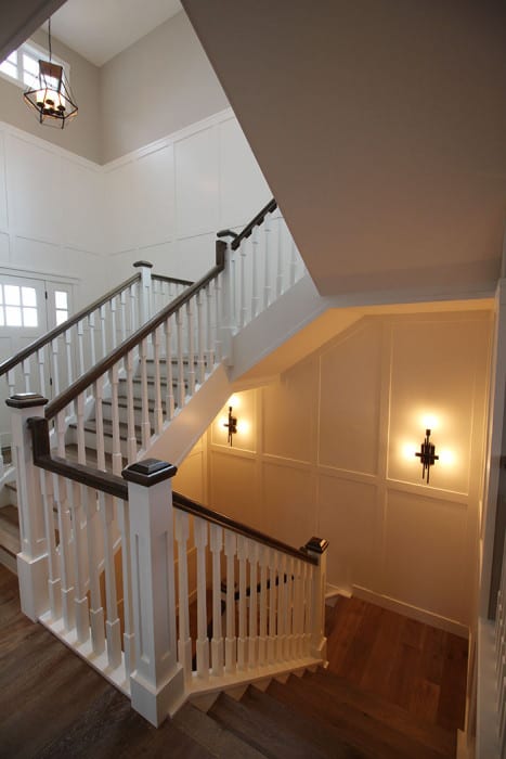 This reclaimed wood barn door is one of my favorite features of the house. Its the perfect place for a touch of color and texture without limiting a rooms decor around it. The feature is more timeless this way.
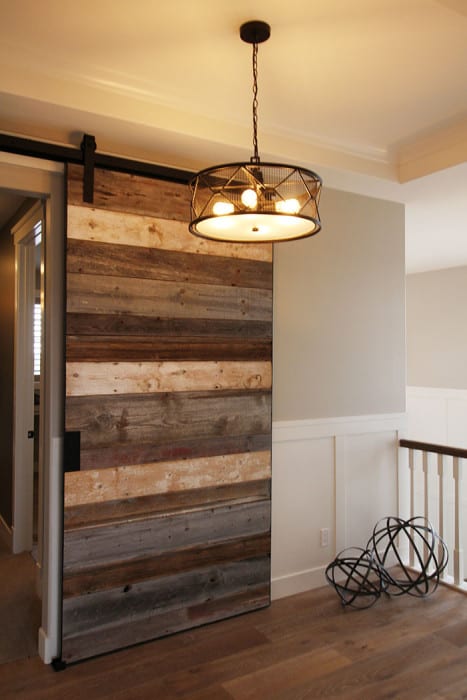
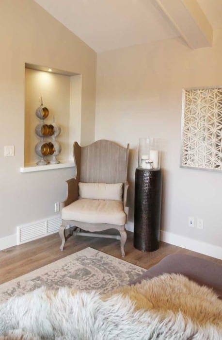
This master bedroom. I just want to run and jump into that bed and never leave. The rustic look of the chandelier and branch sconces have a more modern feel.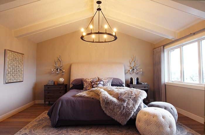 This wood wing chair is awesome. I didn’t actually sit in it, but I wonder if it would be comfortable.
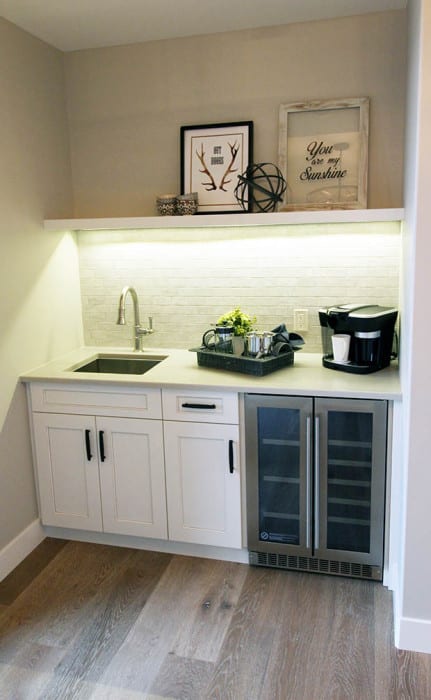
 A wet bar is just off the bedroom leading to an outdoor balcony. While I think this is nice looking, I probably wouldn’t dedicate the space to it. I would rather have more closet space! Although, with a house this size isn’t a space efficiency priority.
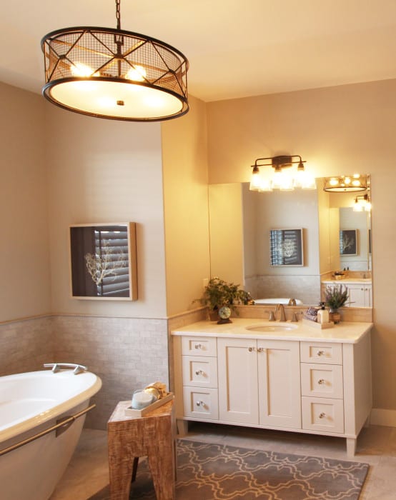
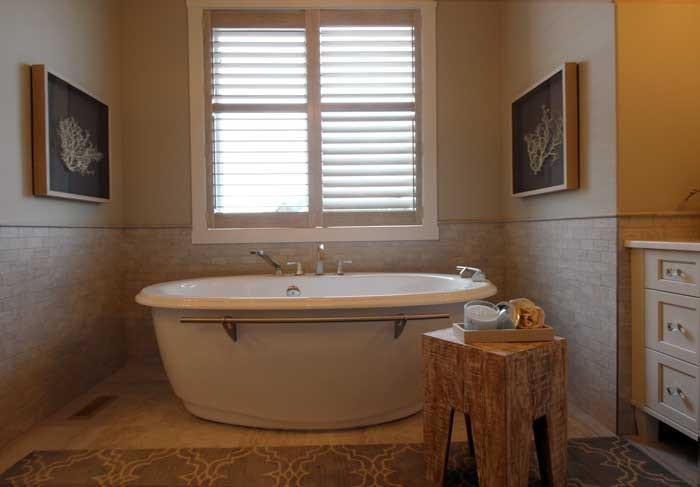
This girls room is dark and moody. It feels a bit deconstructed shabby chic but in a darker color scheme. 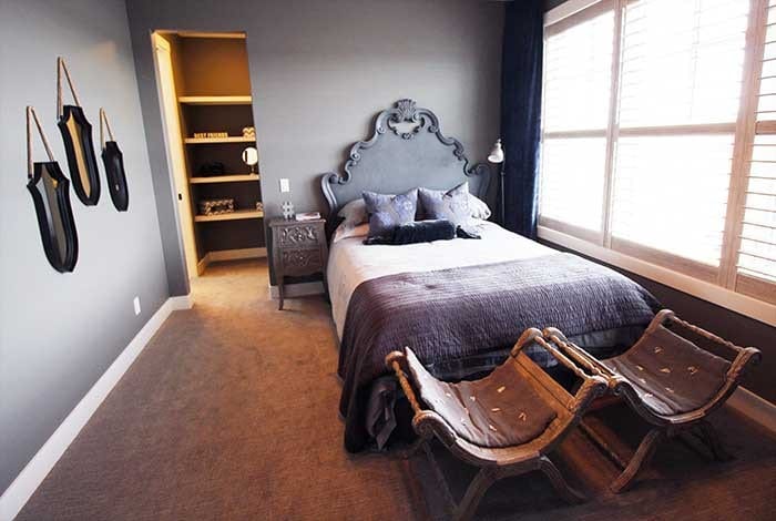
Craft room inside a laundry room. Genius I tell you.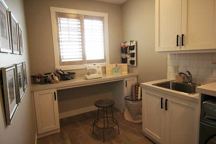
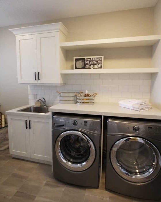 The bonus room
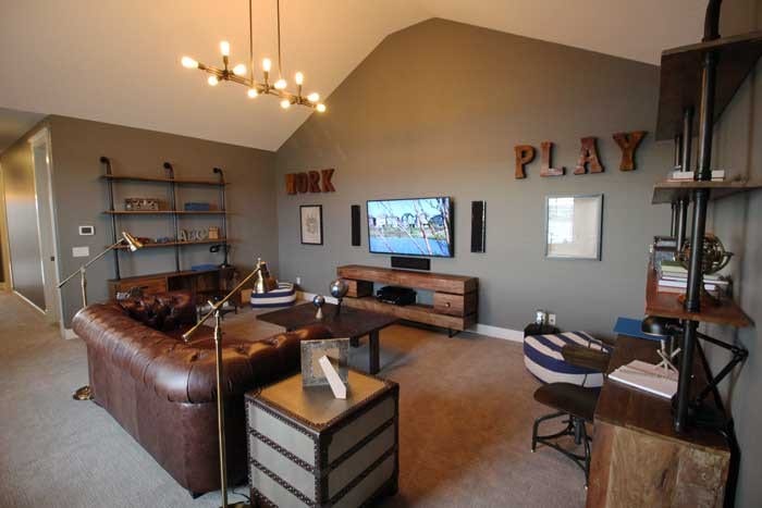 Guest room
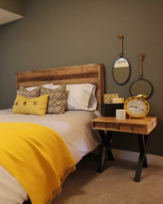
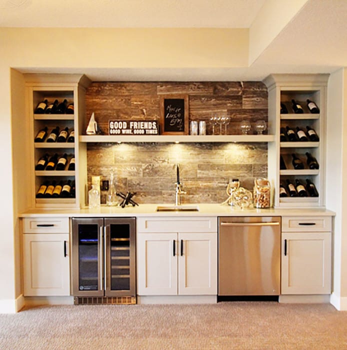
Walk out basement heading to the lake.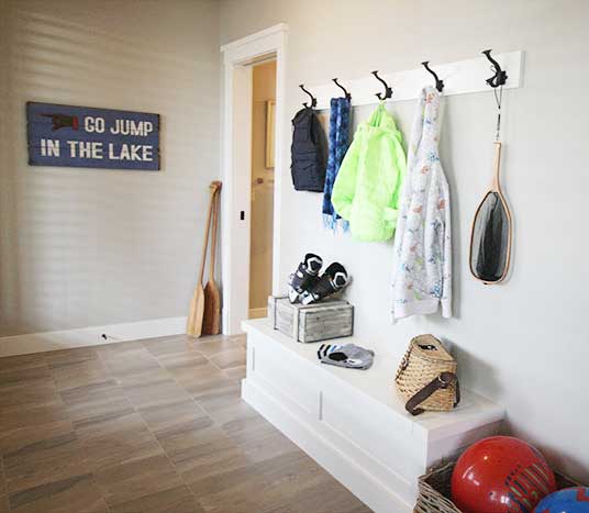 Wine bar
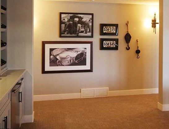
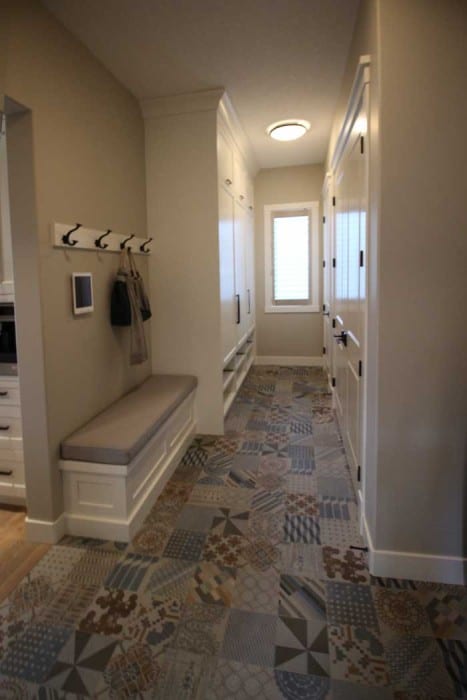
Mudroom / entry from garage.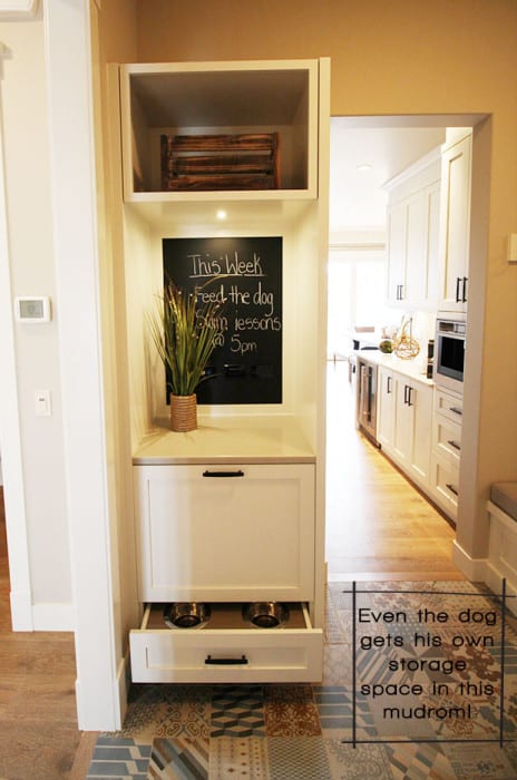 The patterned cement tiles in the mudroom are a unique trend. A perfect place for a pop of color in the walk in mudroom and pantry.
About This House:
Model Name: Sorrento 2
3,665 sq. ft.
3 Beds, 3.5 Baths
Home Builder: Albi Homes
Community: Auburn Bay
This is a spacious estate home with room for a large family. The spacious kitchen has dual islands and opens to a spacious open concept main floor. The great room opens to a large covered and screen in deck. Upstairs the second and third bedrooms each have their own walk-in closet and en-suite. There is an upper level bonus room and laundry.

Leave A Reply!