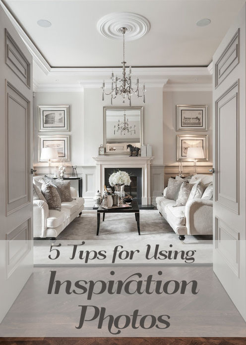
So you’ve got your board on Pinterest labeled “Interiors” and your ideabook on Houzz, both chalked full of pictures of amazing interiors that make you glow inside, but now what? How do you turn all this inspiration into reality in your home…and on a budget that feels microscopic? Or maybe you found that one inspiration photo that made your heart sing, you copied it as best you could, but your room still doesn’t look like the picture…what are you missing?
HERE ARE 5 SIMPLE WAYS TO USE THOSE INSPIRATION PHOTOS TO HELP TURN YOUR SPACE INTO SOMETHING YOU LOVE!
1. FIND REPEATING THEMES
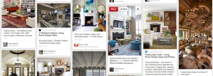 If you are like me, you are drawn to many different styles and your collection of inspiration photos reflects that diversity. That modern room is so cool, but the traditional room feels so inviting…what should I do in my space?! Try looking at all your inspiration photos at a glance (Pinterest and Houzz are great for this!) and see what styles and details you have the most of. Maybe you pinned one or two funky modern spaces, but most of the photos you like are more transitional in style. Don’t forget to do the same with details too. For example, I had a client who was choosing kitchen cabinet finishes for a new home. Her current home had rich, dark cherry cabinets and she said she liked them and would repeat that finish in her new home, but when I looked at her boards on pinterest not one of the photos had dark cabinets. They all had white or ivory finishes. She was surprised when I pointed this out and quickly changed her plan.
2. LOOK BEYOND THE COLOR SCHEME
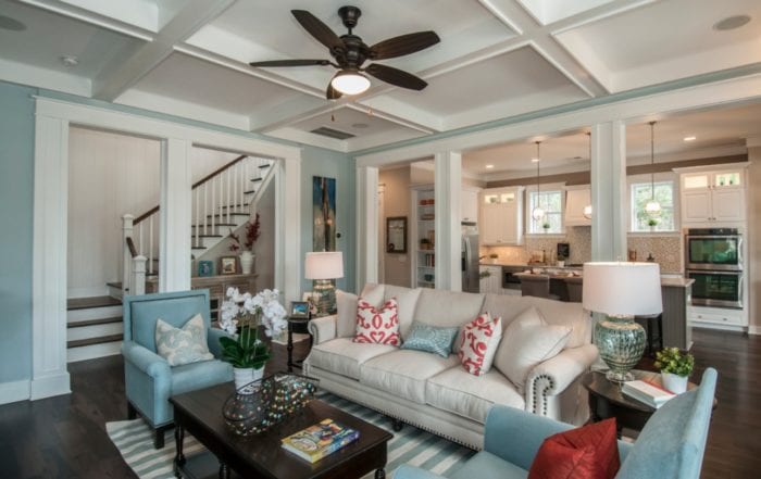
The eye is trained to notice color before other more subtle details. This is natural and the color scheme you use is one of most dynamic design elements. Designer photos are a great source of color inspiration, but chances are you already noticed that and found what colors you want to use. Now look closer. Look at the furniture line, scale, and arrangement. Look at the window treatments, floor finishes, and lighting.
3. MERGE FORM AND FUNCTION
Now we get to a big difference between the inspiration photos and your space…real life stuff. I personally feel that lived in spaces add warmth and comfort. That being said, you may not want those Tonka trucks and pink plastic castles as a focal point. Learning to use decorative bins and baskets can help your space feel more cohesive while still being functional. Another item that can break down a space’s aesthetic is the TV. Most inspiration photos either don’t include a TV or it is carefully incorporated (no crazy jungle of wires!). One option is to wall mount the TV and run the cords through the wall. Google how to do this and you’ll find it’s actually very simple and inexpensive to do. Another option is to carefully plan the TV’s location and housing, being sure to rein in all those wires!
4. STRATEGIC ACCESSORIES
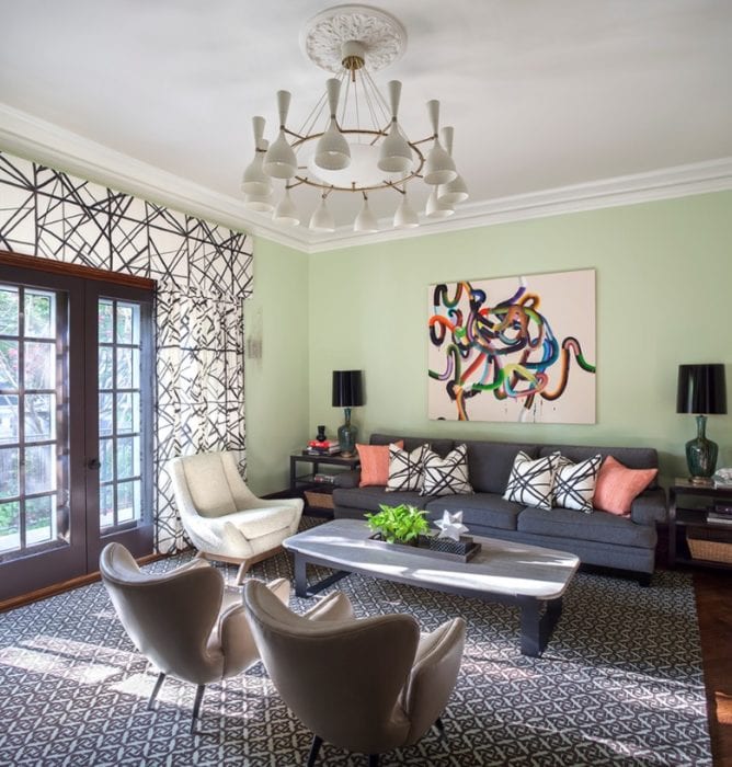 When it comes to accessories, less is more. Notice in your inspiration photos how art work, plants, and general decorations are carefully chosen and placed. They are a great tool to reinforce a color scheme, add variety, or highlight a special object. Try to edit all those “chachkeys” down to the ones you love the most.
5. ADD MILLWORK
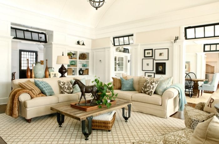 Although this is an example of #2- looking beyond the color scheme, it makes such a visual difference I feel it requires specific attention. I’d be willing to bet that most of the interiors you are inspired by online have extensive wood trims and moldings. It is what sets high-end homes apart from “builder grade” construction. If you have an older home, chances are you already have this, but new construction is sadly lacking this detailing. Do not despair. You can install simple additions that bring character to your space. Easy additions would include crown molding, a chair rail, or beefing up your baseboards. Create a board and batten or coffered ceiling look with a simple grid of wood planks.
Well, I hope these tips help you look at your inspiration photos with new eyes and create spaces you’ll love. Stay tuned for my next post when I take a designer room and create a budget friendly design inspired by it.
Photo Credit: | 1 | 2 | 3 | 4 | 5 |

Leave A Reply!