Interior Design Ideas learned from Showhomes –
The breakfast nook has an adorable table and chairs. I really like the navy blue accent wall. Navy is a big trend coming up in interiors, and I like it. The light and the table look cute. In actuality, I think I would want a bigger table for my own family dinners.
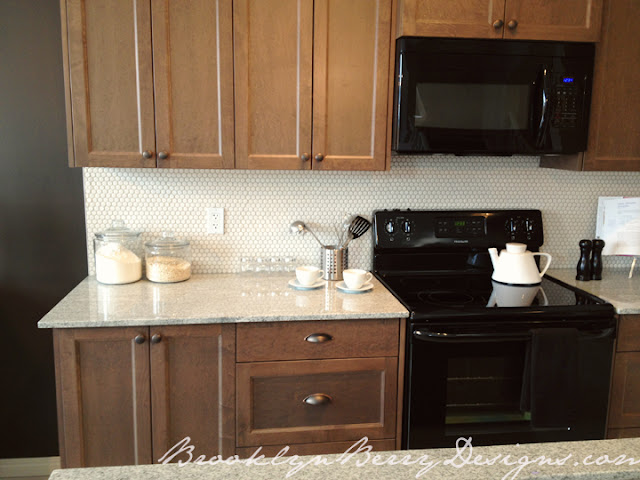
I love this kitchen. As much as I have been big time into white cabinets and white kitchens these days, the mid tone stained wood cabinets are timeless and will always be in. I really like the Navy paint color with the cabinets. This would be a good idea for those with oak cabinets they don’t want to replace but want a more updated look.
I love love love the granite counters and the penny tile backsplash. Timeless, classic, but updated and current. LOVE.
The chevron also looks awesome in the master shower. The white grout shows off the unique tile detail. Easiest and least expensive upgrade ever.
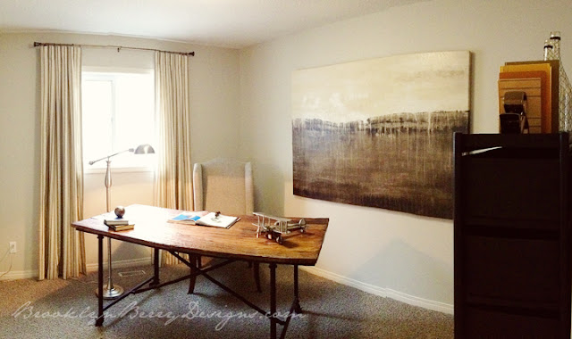
I think this office is pretty. Not really functional, but pretty. I like the art, the wood texture of the desk, and that its light and bright. But who really uses a desk with no storage, floating in the middle of a room? I also wouldn’t ever take a bedroom away to use as an office. Few people need an entire room to dedicate to an office, when a desk built into a kitchen or tech space into a great room would work much more efficiently for space. This is a room that looks great in the picture, but no real house would have this. BUT STILL, its pretty.
What do you think? Am I being too picky?


Comments & Reviews
manaki says
Just curious what show home this is. It looks like my house. Wish I would have thought about changing the corner fireplace before I built!
Brooklyn Berry says
This is from Shane Homes in Cranston. They just opened, and the whole street of homes looks amazing. Worth a saturday afternoon drive by. I wouldn’t mind seeing your house!
manaki says
I built with Shane, so very similar although not quite the same. My house is a Fiesta. Maybe one day I will post pictures.
jamie @ [kreyv] says
I agree with you on pretty much everything! They definitely make them for “show”. I, too, hate corner fireplaces, btw!
Morgaine says
I agree with you totally! I love that backsplash in the kitchen-would match my kitchen perfectly.
http://www.madcapfrenzy.blogspot.com/2013/02/totally-tuesday-1-link-party-time.html
Jan says
Corner fireplace design in the show house – stupid! WHY would anyone turn the back of a chair to a fireplace? What’s the point of having one then, geez. FOCAL POINT. Duh. Decorating 101. Who did the interior, don’t hire them!
Brooke says
I think the corner fireplace is the builders decision, and I think they are hard to work around for furniture placement for just this reason. However, I think that the chair almost has to be placed in front of the fireplace or else you wouldn’t have any seating! The only other alternative would be a sectional.