Finding and designing a tile pattern is harder than you think.
When helping clients to select finishes for their new construction homes it seems like the tile is the hardest choice. Why is tile so tricky? For a new home you need a lot of it. Tile floors in the mudroom and laundry room, a backsplash for the kitchen, a fireplace surround. For the ensuite you have tile floors, a tile tub surround, a tub skirt and vanity backsplash and the same is repeated in the main bathroom. Phew. That is lots of tile. And it seems like there is a massive separation between what is affordable and what is pretty. I have spent a lot of time figuring out how to break up tile for interest, pattern, and cost savings. Here are a few tricks I have learned to get high impact tile designs without breaking the bank.
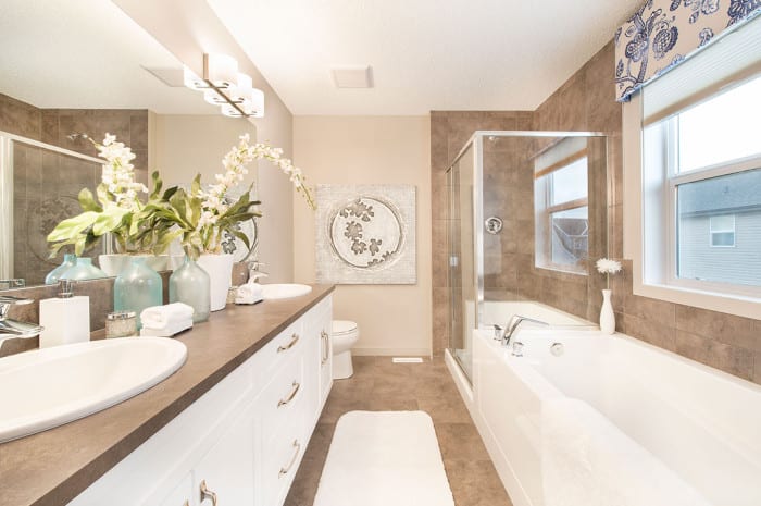
 This is what I am trying to end. It looks ok, but its just plain BOOOOORING. The brown galore makes me a little crazy. Photo via
Splurge On Small Areas
Use a simple inexpensive tile on the floors, and add some flash to a fireplace surround or backsplash. For people who don’t like accent pieces or borders, this is your winner. Choose where you want your focus to be, and spend your tile budget there.

I might want to cook a bit more if I had this gorgeous tile to look at.
I wish every bathroom had a fun tile floor like this. I would personally scrub this on my hands and knees and still smile.
Add An Insert
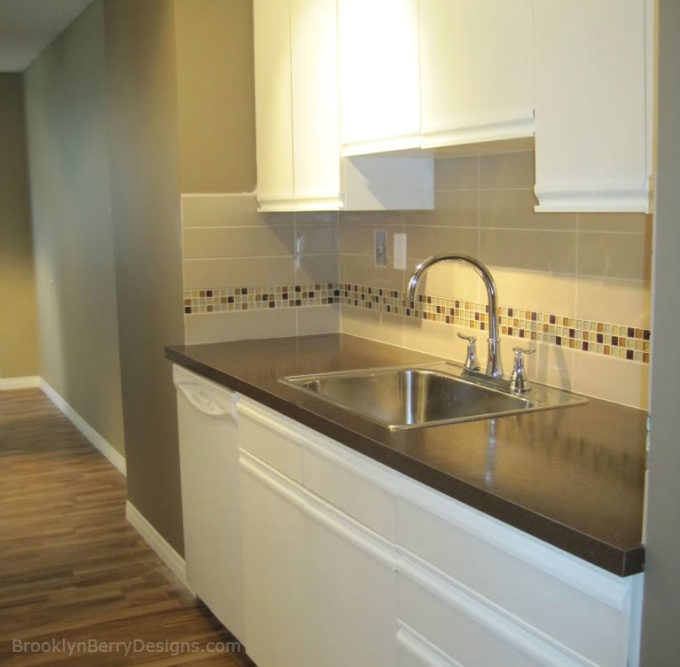
By using a 3″ or 4″ strip of mosaic tile you are able to get 3 or 4 linear feet out of one sq. ft. of tile.
In this 70s apartment remodel, I used an inexpensive tile as the main tile, but added the glass mosaic tile strip for a little touch of bling. Because of the limited size of this kitchen, I only had to buy 4 square feet of tile – keeping my budget in line for this small 2 bedroom apartment.
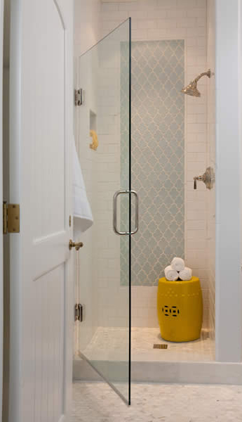
This wall niche and tile border give interest without breaking the bank.

One section of a tile shower wall is shown in the unique shaped accent. It stands out more as an accent wall than if the entire shower were done in this piece.
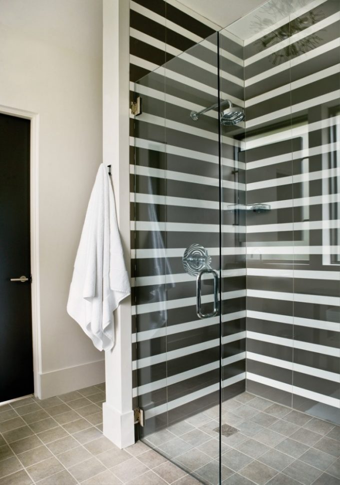
Use An Ordinary Tile In An Extraordinary Way

Sarah uses a simple white subway tile but installed it in a vertical herringbone pattern with a grey grout to draw your attention to the tile pattern.
Again, a simple tile installed in a herringbone pattern makes a big impact. The light grout with a dark tile lets the pattern take the stage.
What style of tile do you like? Bold and beautiful? Simple and subdued? Or a balance of the two?


Comments & Reviews
Kyla @ Mommy's Weird says
I LOVE the subway tile. Looks awesome!