Does that light make your house look old?
Like clothing, the colors, lighting, and decor of your home can age your house and make it look old and worn. Whether I am walking through a clients house prior to a design project or just browsing homes on the MLS, there are a few features in a house that immediatley stop me in my tracks. As a designer I can look past these features, knowing what they could be transformed into. For the home buyer who doesn’t have the DIY skills or doesn’t want to have any projects, there are a few things features in a house that need to be addressed.
The Sunshine Ceiling
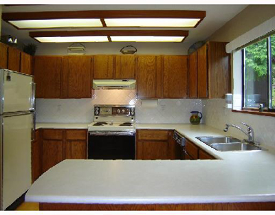
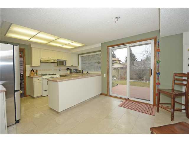
If you grew up in the 90s you might not know what I am talking about. Its the large box that drops down from the ceiling with florescent lights inside. Like a big box of sunshine, it begs to be taken down. The sunshine ceiling is a tell-tale sign of a home that is getting old. Removing it may require repainting the ceiling, but some pretty pendant lights will make your kitchen look much more modern.


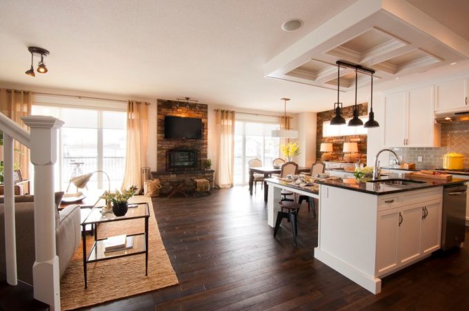
This showhome has a box on the ceiling which is a great way to hide a faded ceiling after removing a sunshine ceiling.Cultured marble counter tops with built in sinks
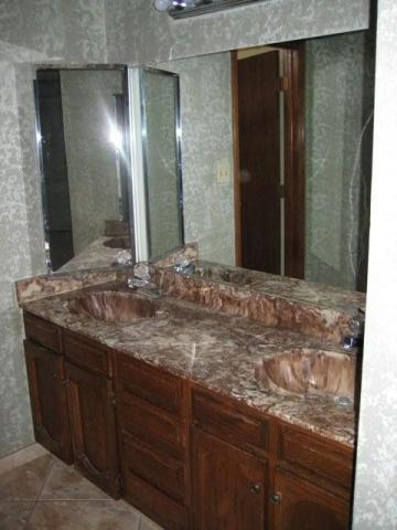
More durable than laminate, the cultured marble counters seemed like a good idea. However, every good thing can be over done and the one piece sink and counter transformed into the most hideous bright colors and interesting shapes. Shell shaped sinks? When I am working on a design project the marble sink is the first thing to hit the remove list. Instead, opt for a simple laminate counter, or better yet caesarstone or other quartz products.

 Simple laminate counter tops used in a model home. Home design by Brooklyn Berry Designs. Construction by Sabal Homes.
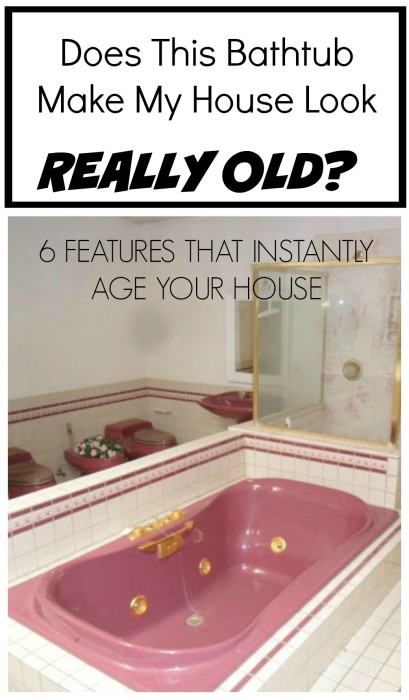
Colored Sinks & Toilets
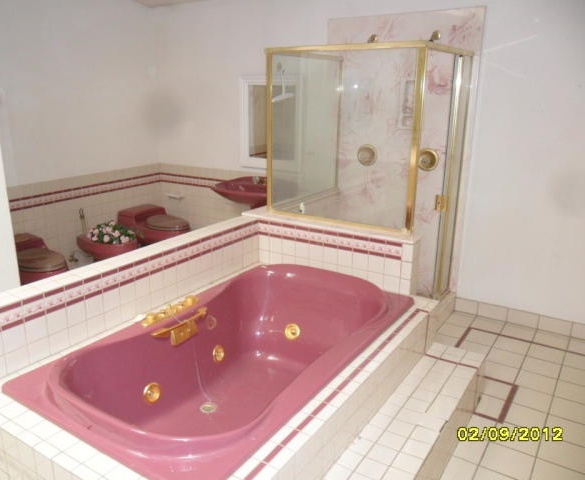
Why do we want purple toilets? I just don’t understand. It may seem like a great idea for a month or two, but you will always tire of seeing the color. Play it safe, a simple white stands the test of time. If your commode is anything other than white or cream, consider having it replaced. Not only will your bathroom look better, a new toilet will save you a lot in water costs too.


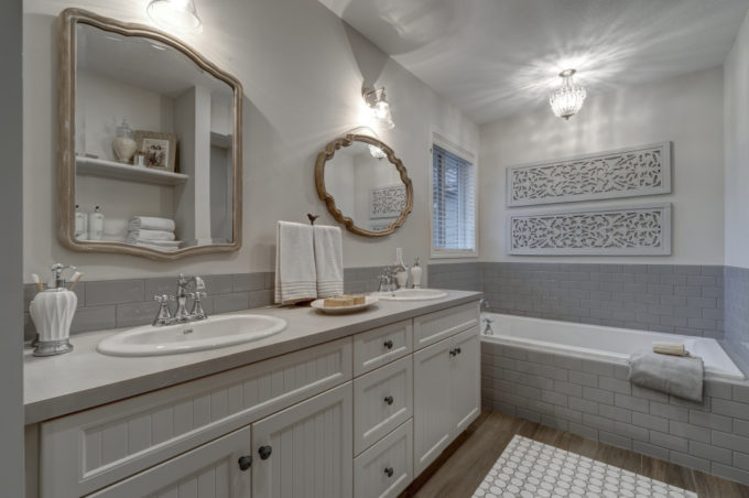
 This brand new bathroom has touches of color and a nod to the vintage without looking dated.
Wallpaper Borders
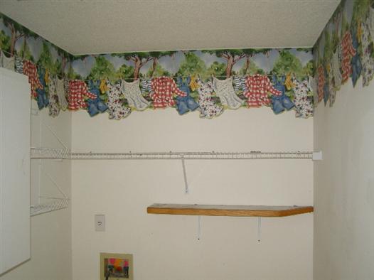
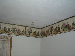
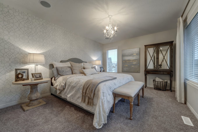
While wallpapering is a trend that has made its way back into the mainstream, it has an updated style. Long gone are the floral or character wallpaper border adorning the top 8 inches of your wall. Instead, opt for a single full wall feature in a bedroom or living room design.


Here is a home I designed this year with a full accent wall with one simple wallpaper pattern.Scallop or Balloon Window Valences
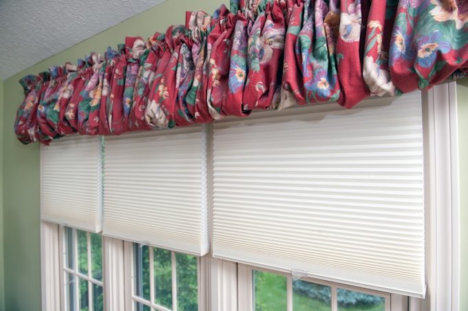
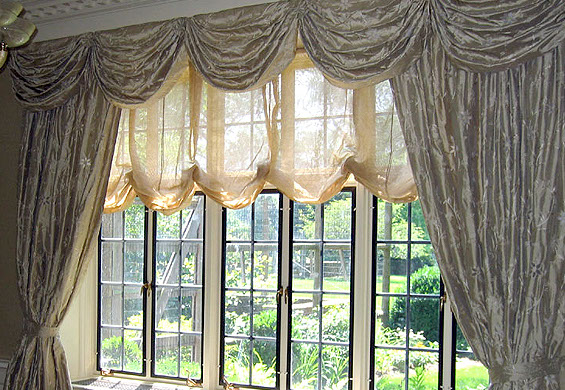
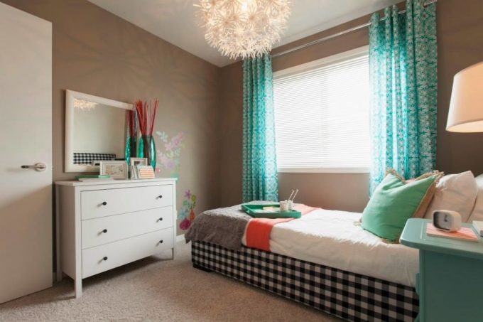
These window treatments are still very fitting in formal spaces – often hotels or historic venues. In the every day home they have been replaced with simple panels.


 This girls room has some simple full length window panels. They add some color to the room without being too crazy.
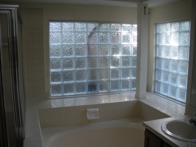
Glass Block Windows
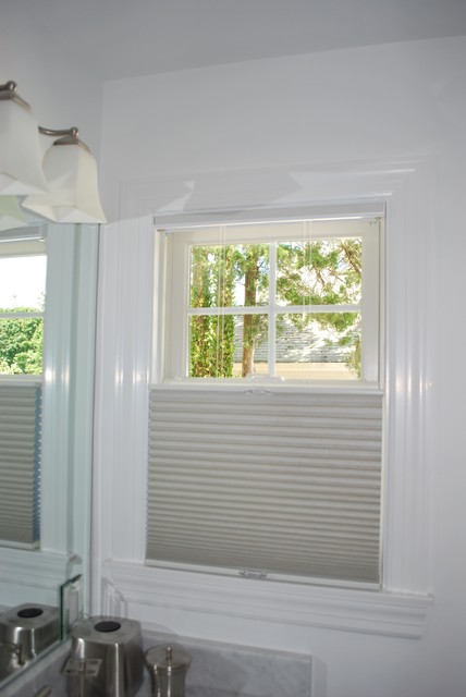
Often used in bathroom windows above the bathtub, the glass block windows were a great idea to allow light in but still provide privacy. No longer in style, I recommend replacing it with top-down and bottom-up window shades, or a frosted window.


Does your house feel new and fresh? If your house needs some updates, or you are not sure where to start, email me your design questions!




Comments & Reviews
Wanda L says
I can add a 7th for you…popccorn (or cottage cheese) ceilings. Have changed the 6 you listed, but can’t get my hubby to change the ceilings. 🙁
Brooke says
Its funny, I love a flat ceiling, but don’t hate the popcorn. My husband hates it, but from all my years in the construction industry, the cost of adding it upfront was about the same as granite counter tops. I always thought, for the cost, I would see, touch, and feel my counters way more than the ceiling. I would remove popcorn in a remodel, but not while I lived in it!
Sarah @ 2paws Designs says
“Sunshine Ceiling” – too funny. I knew what you were talking about, but had never heard it called that. Lots of great & simple tips here to update a home.
Brooke says
Thanks! Yes, I am not sure where that term came from, but its always what I have heard them referred to as! Thanks for commenting.
Momof3 says
My sunshine ceiling takes up basically the whole square footage of the kitchen. And then if you remove the faux glass panels, the attic access panel is under it. What do you do with that? I desperately want to change it, but simply can’t afford a lot.
Brooke says
When you lift the plastic panels what is underneath? It is usually just drywall but it may or may not be taped and mudded. Worst case scenario it will need patched and possibly repainted. Maybe the light taking up most of the kitchen would be a good thing in this case.
momof3 says
I can send you a picture if you like…I’m not too great at explaining. If you lift up the panels, the drywall is finished underneath, except on the far left where they have an attic access panel.